Functional and Cosy Birštonas Library
Authors: Dalia Čiupalaitė, Matas Šiupšinskas
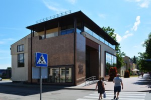
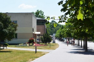
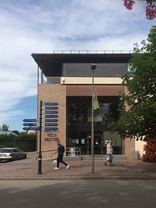
The Birštonas Library is located in the reconstructed and expanded premises of a former department store. The simple, utilitarian shell of the store has changed but its laconic structure can still be felt in the new library space. Sitting perpendicular to the street, the low volume does not encroach on the neighbours in terms of its scale, connected with the surrounding life of the town through its large windows and facing the wide pavement, which slowly traversed by the guests of the resort town. The core of vertical links, i.e. the entrance and stairwell unit was designed on one side of the building, while the remaining area is dedicated to various activities, no matter if they are department store or a library-related. The plan structure is clear, almost functionalist.
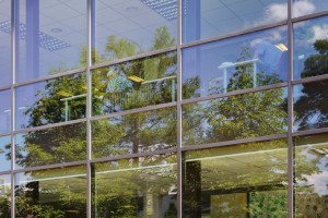
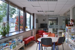
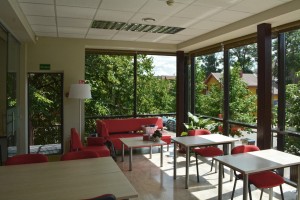
After the reconstruction, the building grew slightly taller, now comprising three storeys. The lower two open-plan floors are dedicated to visitors: the ground floor area serves children, teens and youths, while the first floor is for adults. The second floor houses the administration. The key elements on the visitor floors are an oblong, less formal space by the street-facing facade and an entrance/lift zone with the remaining large part of the floor dedicated to bookcases. The floors are divided into even smaller, localised zones by function, using glass partitions and furniture. The part of the building facing the street is finished in window panes, while the areas located along the opposite facade are lined with narrow horizontal strips of windows that ensure lighting but reduce fading in books. The most popular and attractive space is next to the large windows, where you can enjoy a vista of the street and watch pedestrians passing by without haste.
The location given to the library ensures its visibility and significance of as an institution within the town. The library is located on the main street that leads from the entrance to the town and the bus station toward the concentrated downtown area bustling with resort life. Due to the increase in height, the building is now slightly taller than the surrounding structures and is perfectly visible. Its entrance is symbolically accentuated with a portal that spans two floors with its window panes. The glass plane is surrounded by sturdy walls covered in decorative tiles. A couple of steps lead up to the door, with a ramp on the side for the differently-abled visitors.
The clearly accentuated entrance leads to a lobby. From there, a consistent path leads to various spaces that comprise the library – the further away from the entrance, the quieter and more enclosed the space. The child and youth area is on the ground floor, adult spaces on the first and administration is on the second floor. The spaces share a hierarchical relationship, arranged based on a number of factors. First of all, on how often the visitors come in and out of the area and how intensively they move around inside it. Movement is somewhat separated from resting areas in order to have less traffic going through those spaces which demand more focus. Spaces are also separated in terms of sound into quiet ones and ones where some sound is allowed. For example, the director decided the children’s reading room should be placed on the ground floor so that the children can easily reach the building and move in and out without disturbing other visitors who may need silence to focus. Children are active, they come and go.
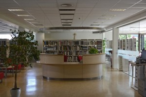
In terms of aesthetics, the building is simple. A strong visual connection with the street is probably the most prominent quality of its interior in terms of aesthetic experience. The ground floor and first floor mirror each other in their structure. In the reading rooms, everything is arranged according to the principle of gradually increasing privacy: people, furniture, resources, etc. The space of the reading room is filled with bookcases, with places formed among them for the visitors to work or rest. As you step inside the reading room (either the child or adult one), you will first of all notice the service desk in the centre.
The round service desk, the inspiration for which came to library’s director during a trip to Vienna, is in the centrepiece of the space and we can also recognise what it is from the info text on it. Being massive and located in the centre, it is reminiscent of the secretary’s desk in Jacques Tati’s film Playtime, when the protagonist Monsieur Hulot arrives at the office building. It is large and very visible. There’s no case of the disappearing librarian here, so common in contemporary libraries (especially ones of national importance). In this library, the staff take up a central position. However, it is not a position of control but rather one of support, which is evident from how visible the librarian is, how much the staff member sees and is seen sitting at the desk. The visitors’ work, leisure and children’s play areas do not have direct visual links to the librarian’s desk. These areas are located by the windows, in the street-side part of the building, separated by a glass partition, as well as deeper inside the reading room by the wall, in-between bookshelves. The fact that the desk is a help point is also evident from the observed interactions between the visitors and the staff. E.g. in the child and youth reading room, the staff were talking to the children, picking up and recommending books. It functions more like a hub for human interaction, a bar that the visitors like to lean against rather than a controlling body.
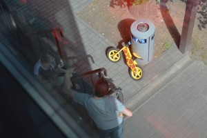
The children and youths’ reading room is divided into smaller zones through furniture. The librarian’s desk at the centre is surrounded by bookcases with a table for visitor activities available among them. Further inside, there are computer workplaces for children. The child reading room has a separate zone for teenagers and youths, which features a foosball table. Soft furniture and small tables surrounded by bookcases form a small, cosy space. This is a highly important, yet rather rare feature in libraries, which not always have spaces for youths. Behind the glass partition, by the window facing the street, there is a play area and a reading room for toddlers. Everything is adapted for children here: low shelves and a little table with chairs. The ground floor also features a makerspace, often found in contemporary libraries. Noise is not limited on this floor. But the conversations between children, teenagers, other visitors and the librarians scatter throughout the space without interfering with each other.
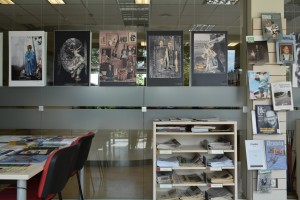
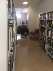
Come up to the first floor by stairs or lift and you will find yourself directly in front of the reading room, the spaces freely flowing into each other without any barriers. The floor also includes smaller areas, e.g. an ethnographic reading room and one dedicated to computer work. In the adult reading room, the physical, symbolical and interaction centre of the open plan space is also the librarians’ table. The space around it is filled with bookcases, which are arranged in a way that allows visitors to move comfortably between them and easily reach the desired subject. The columns that hold the building up were put to use to display books, while the glass partition also acts an exhibition space. A number of small tables were distributed among the shelves, allowing you to focus on your work covered from the prying eyes of everybody else. A glass partition separates the part of the reading room that is mostly identified as the periodicals area but is also the main space of the reading room where the visitors can have a seat and carry out their work. It is well-lit, overlooks the town and some trees, as well as the rooftops of the houses across the street. The visitors are offered the classic work scenario, with most desks arranged in a classroom-like pattern, although there are other tables available, which bring the readers closer together, and in the corner, there is a rest area with couches. Therefore, the whole first-floor area clearly guides the visitor and provides for a comfortable and easy experience. It has an obvious info centre, a possibility to see the whole space at once, and you can choose whether to strike a conversation with other visitors or focus on individual work hidden behind the shelves. Utilising the reading room in such way is not aesthetically expressive or particularly socially activating but it manages to lay out library’s functions in a cosy, simple and, at the same time, well thought out manner.
The top floor is dedicated to the administration, comprising staff offices and a kitchenette. It also has a space for chamber events and seminars, and there is a balcony in the corner of the floor. From the outside, the top floor appears as a dark glass structure laid on top of the two-storey visitor block. Above it, a thin roof hangs slightly extending over the volume. It looks like a building on top of a building – a more massive two-storey volume for the visitors with a lighter administration box on top of it.
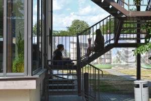
There is also an ancillary structure, an external metal staircase, primarily intended for fire safety. The stairs zigzag down the side of the building, adding a sense of intimacy and permeability to the library and providing direct access to the first and second floors. Thus the visitors can get straight to the reading room and the staff – to their offices, without having to pass various other areas. Because of this, the adult reading room feels less enclosed and isolated. Especially in summer, when the building becomes warm and the door to the staircase is kept open to let in some fresh air. The stairs are also an attractive structure for taking a seat and form an active physical connection between the building and the outdoors – something the library somewhat lacks. The library is firmly established within the urban fabric but it is also looking for ways to expand its activities outside in the form of an outdoor reading area.
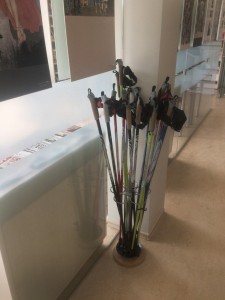
Currently, the outdoor reading area is only in the planning stages but the library is already making efforts to expand its usual activities by holding numerous events, which attract new people to come here. The library can offer to lend you some Nordic walking poles, or you can do some knitting, join a therapeutic reading group where literature is discussed with a psychologist, print something on a 3D printer or participate in classes that use virtual reality headsets. All of this alongside things that are already common in libraries: exhibitions, readings, lectures, concerts and other cultural events that take place not only in the small hall on the top floor but also in the Kurhaus of Birštonas hall, various health resorts and in open air.
As mentioned in the previous articles in this series, sound is a very important aspect when assessing library architecture. The acoustic atmospheres of libraries should be designed in a way that provides the possibility for quieter zones to appear alongside areas for interaction. In the Birštonas Library, noise is suppressed and it is neither too noisy, nor awkwardly quiet. In summer, sounds of the town creep into the reading room – it gets hot inside (like in most public buildings with non-opening windows and no air conditioning system or one that does not function), so the doors to the outside (or the exterior staircase) are kept open. Reading in the periodicals reading room, you can overhear a staff member talking to a visitor borrowing a book. The architectural and interior solutions here do not create any prerequisites for unfavourable collisions of different activities of the visitors, who themselves seem to adhere to certain informal rules, i.e. they are considerate of each other. In the child and youth reading room, as it has the whole floor dedicated to it, children’s voices spread out easily without disturbing adults who want to focus on their own matters.
There is no area specifically designed for interactions and conversations but one can find localised smaller spaces that compensate for that. For example, in the service zone, you can find couches where small groups can sit down together. But during our visit, as opposed to the Druskininkai, Utena or Zarasai libraries, we did not find any areas specifically created for interaction. As the visitors borrowed books, they interacted with the librarians rather than with each other, while others read newspapers. Only the children’s area acts as a place to meet up and spend time together. Children have as much space as the adults here. They are offered a wide array of facilities: there are places for toddlers and teenagers, including couches, desks and little tables. During our visit, children were playing computer games, borrowing books, chatting with each other, flipping through books together, talking to the librarians.
The library is truly simple and an outsider might find it unimpressive but its spaces are well thought out and convenient for regular visitors. How were such decisions made? Global tendencies in how libraries are arranged are known to the library staff and some architects. New trends reach Lithuania through librarians’ experience, which they gain by travelling to foreign libraries, seeing how their spaces are designed and becoming inspired to implement similar principles in their own towns. Innovations are also suggested by architects who take into account international trends in library architecture. That is why the various different buildings analysed in this series of articles seem to use architecture in a way that implements principles very characteristic of contemporary libraries: openness, mostly free-flowing open-plan structures, visual connections, freedom of movement for the visitors. Especially open and easy access. Libraries also take on additional functions: makerspaces, DIY areas and means for various tangible creative work, as well as using all sorts of methods to encourage visitor activity from therapeutic knitting to yoga and Nordic walking classes.
The librarians, especially the director of the library, often get ideas through direct experience gained by visiting foreign libraries. Architects also travel or study reference material – visual examples found on the internet or in magazines. But even when considering the same example, the librarians and the architects often find different design features to be key. The former are interested in the work processes that take place in the building, while the latter care more about how expressive the spaces can be. Perhaps this is why a meaningful collaboration between the authors and the users of a building not always happens. Sometimes the librarians describe their arguments with the architects as a sort of struggle, which, if lost, leaves them having to look for their own ways to establish a library in a space that is not entirely suitable.
Although the Birštonas Library turned out to be comfortable and rationally fitted out, a few arguments did spark along the way. One of the reasons for that may have been the fact that neither the director Alina Jaskūnienė nor any representatives of the staff were included in the contest committee, and were only allowed to get minimally involved in discussions when designing the future library. Opinions were divided regarding certain solutions in the building. The lift does not go up to the second floor, so visitors that find it difficult to go up the stairs require help from the staff during events on the top floor. According to the director, opinions were also opposed regarding the lift lobby. The director wanted the reading room to open up in front of you as soon as you step out the lift or the stairwell, with the whole floor being a continuous space. At first, the architects proposed to separate the lift lobby from the common area of the first floor and only later agreed with her suggestion. One of the most prominent changes in the design also sprang from the opposition in opinions between the architects and the staff. An interior balcony was planned on the top floor next to the staff offices, while in the periodicals reading room, the ceiling was supposed to be two-storey tall with expressive (and expensive considering the budget available to the library) light fittings. The staff would have had to access their offices through the balcony. This decision, which had the potential of opening up a more interesting visual perspective in one of the spaces of the library, according to the director, would have posed practical issues when using the library: the reading room would have been a tall, narrow space, merging with the staff and transit areas, and so the only adult reading room in the library would have become noisy. The staff would have had less privacy (wearing a skirt would possibly have been off the table). Furthermore, a space like this is more difficult to operate on a limited library budget.
After covering up the periodicals reading room, the top floor of the Birštonas Library suddenly had extra space for chamber events and seminars. The library also has an entertainment hall in the basement, but it was designed with a low ceiling and the library’s director says it is uncomfortable and as such remains unused. It is dark, depressing, and you can reach the ceiling with your hand. It also has lockers for the visitors to put away their stuff but these are not very popular. Climbing all the way down to the basement just to hang your coat is simply inconvenient. Especially when you can easily hang it in the reading room, which has its own coat hangers. The entrance lobby on the ground floor also seems underused.
Solutions that may have appeared impressive on the drawing board but are difficult to maintain in reality can be found in various libraries: skylights that are rarely cleaned or are covered up with stickers to keep the books from fading, windowsills at ceiling level that are covered in dust. “It has to be pretty but also practical.” This thought, expressed by the director of one of the other libraries is stuck on repeat in my head like a refrain. It must be like that but it must also be beautiful. But the beauty could come from considering the specifics of the site, from analysing how the building will be operated and understanding that its life does not end after the grand opening. Banal things like whether or not it will be possible to clean the dust off of windowsills, what the noise levels will be like and whether the staff will be able to freely choose what clothes to wear, are worth considering. When designing a library, same as any other public building, one has to search for a balance between architectural expression and practicality. In library buildings, the aesthetics and the delight that architecture can provide is very important because it encourages you to visit, stay, read something or walk around between the shelves in a nice looking space until you find a book that interests you. However, during the design process, the visual solutions should be imagined as a real, material structure that will exist in time and within the library’s budget constraints. Practicality and aesthetics should merge rather than exist separately without serving each other. In the Birštonas Library, the balance seems to be leaning more towards practicality than aesthetics. The practical and well thought out interior is the result of a collaboration between the library staff and a furniture company. An interior design project had been proposed by the architects but it was most likely just a preliminary demarcation of various visitor areas; the design featured long bookcases stretching through all the spaces, no matter if they were for children or adults, that would have forced the visitors to walk in large circles before they could the required department. Therefore, according to the director, the interior was instead created by considering specific scenarios of use within the space, drawing right there on the floor and precisely calculating what types of furniture the library would require. Despite said disagreements, the library has fulfilled and exceeded its purpose and boasts a light and pleasant atmosphere. The building feels open to visitors with liberal access (there isn’t even so much as a gate but books are not disappearing) that is not restricted neither physically nor emotionally. Freedom also radiates from the institution itself and the eye-catching leisure literature on the shelves. The building is well-lit, you can feel the pulse of the town thanks to its large windows, and as soon as you step inside, you will find yourself in the middle of a lively children’s department. On the ground floor, which forms an extension of the street space, not only the space itself is horizontal but also the relationships that form here. Children can play, chat and interact without any tension, silence or shushing. Even as you go up to the adult reading room, there is still no tension. You feel free and welcome.
Perhaps it’s no use looking for innovative and impressive architectural aesthetics in this pragmatic building. It does not have expressive spaces or eye-catching design solutions and the facade, finished in ‘safe’ brownish shades is also unsurprising. But at least the library does not pretend to be something other than it truly is – it won’t try to impress you with eccentric forms or furniture. This is a simple building for a simple library and that is what makes it charming. It isn’t stunning but it’s not hideous either. It gives off a casual vibe where you can freely enjoy yourself. To feel the charm of the place, you don’t have to intently stare at the facades or interior accents. Instead, you can comfortably settle in next to a large window, open a book and enjoy the natural light and the silhouettes of people passing by.
M. Šiupšinskas and D. Čiupailaitė photos
