When Form Does Not Follow Function

Authors: Dalia Čiupailaitė
Have you ever travelled by bus overnight? Imagine you are, say, from Vilnius to Warsaw. Does your seat not recline? Even if it does, your legs probably still feel numb, your head leans to the side and you wish the footrest was at least a little bit closer. Or perhaps you’re being squished by a passenger reclining in front of you and you’re struggling to fit inside a space that doesn’t suit your body shape? At last, you find a more comfortable position and manage to drift off. You make use of every little detail unintentionally given to you by the designers without really having your comfort in mind: the armrest of the seat in front of you, the gap between the seats, the nearby window and that small area conveniently running alongside it, where you can just about fit your foot – or you block the aisle by stretching your legs across it. In much the same way, we sometimes struggle to adapt to buildings.


Some buildings are more flexible and universal than others in terms of their spaces (i.e. their shape and volume) and spatial structures (i.e. interconnectedness, ability to move from one room to another and being nearby). A structure may accommodate a school, which can later be replaced by a library or a hostel. Other buildings strictly prescribe the relationships between human activities inside them: the possibilities for movement and rest, the patterns of separation and encounters between people, sound flow, visibility between spaces. If the architectural idea does not match the way an organisation’s (say, a library’s) activities are structured, it will be much more difficult for that organisation to settle in in these spaces. Sometimes one erroneous decision is enough to, in a sense, send the building crumbling down like dominoes. However, the same way a person on an overnight bus makes use of every little protrusion to position their tired body more comfortably, the users will find ways to tame a resisting building. In order to make it cosier and more familiar, they will leave certain signs of their presence: potted plants and paintings, maybe a change of wall colour or a pencil holder on their desk. But when a building does not fulfil the needs of its users at all, they revolt and change it radically.
Pagėgiai Library[1] is an example of that overnight bus journey situation, where you have to rely on your wits to create an acceptable space for yourself. But first, let’s look at the building from the outside.
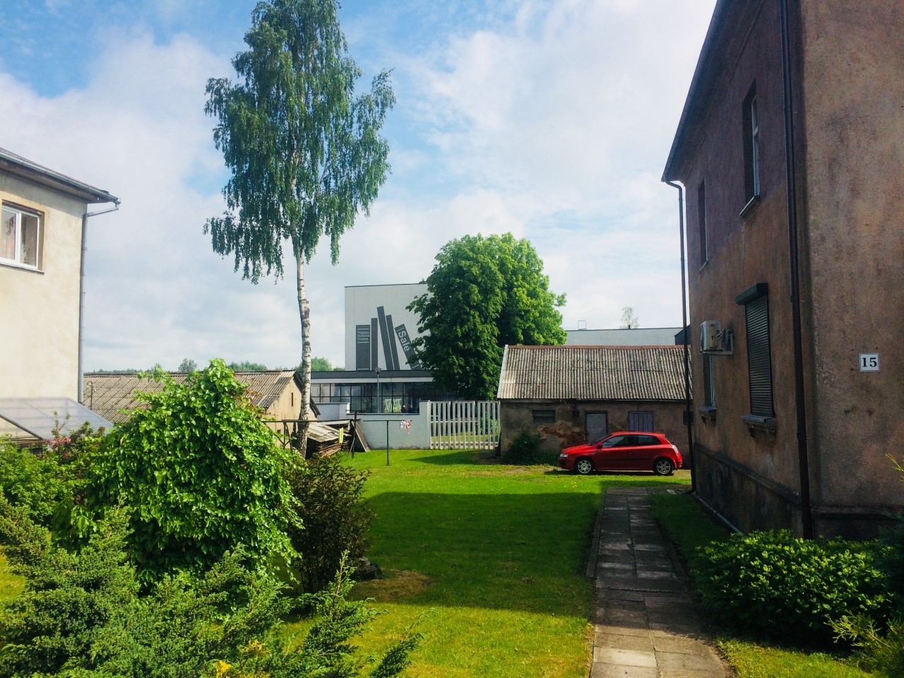
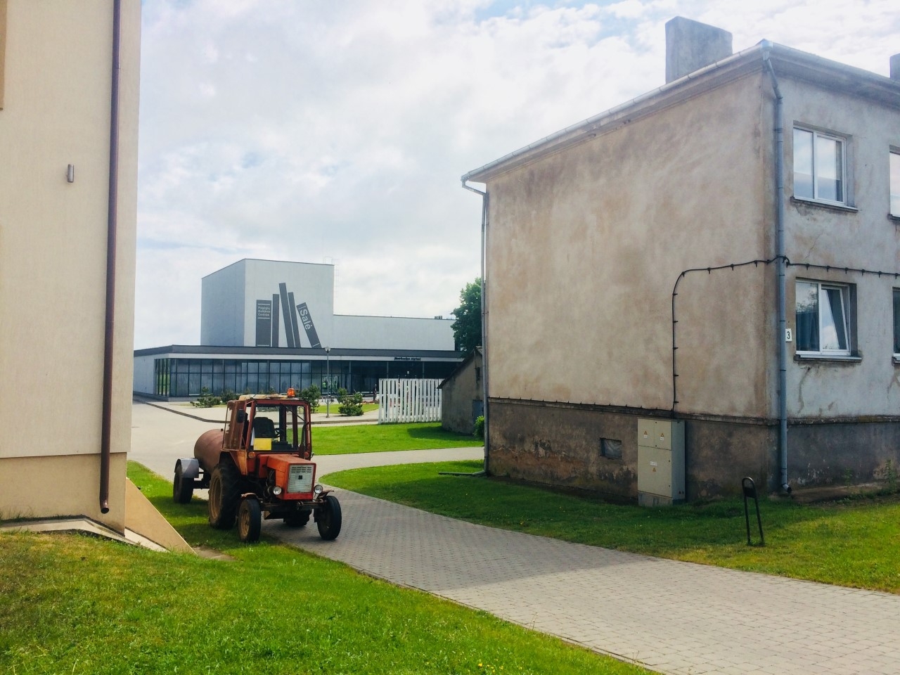
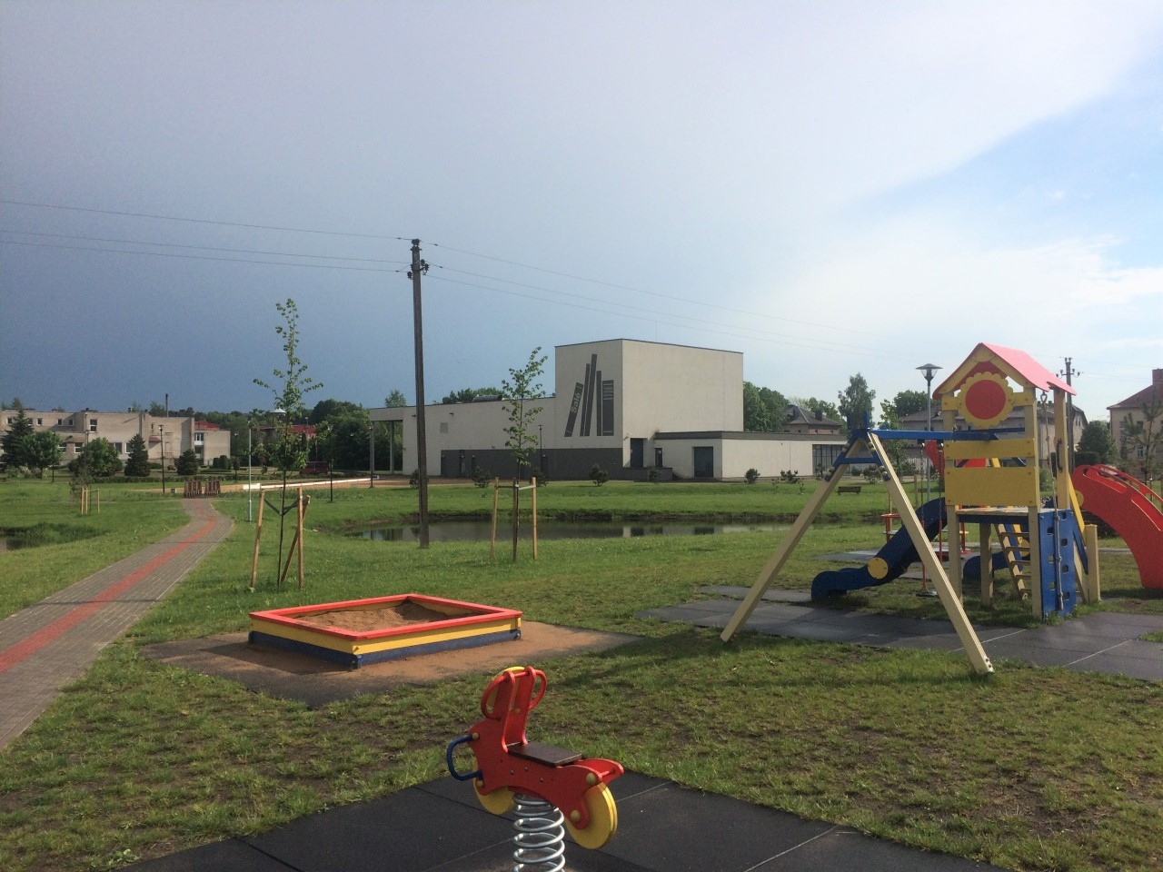
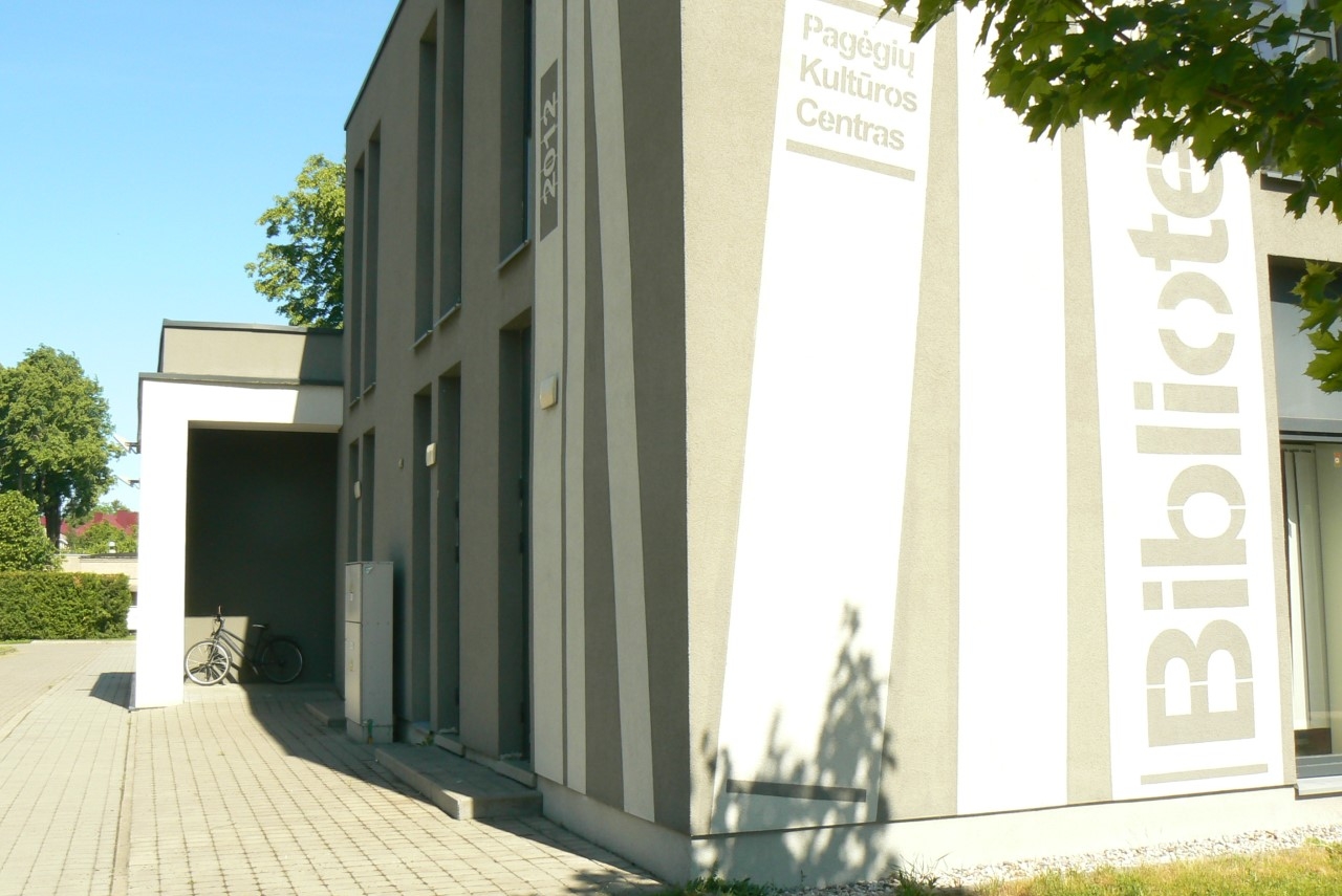
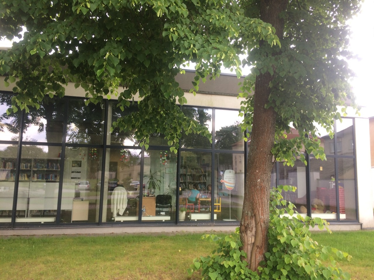
Pagėgiai Library is located in a building on the edge of town, which also accommodates the Culture Centre and the Civil Registry Office. Open fields stretch way into the distance behind the building, but at the same time, it is visible from the main, Vilniaus, street that goes across town. Most of the town’s buildings can be seen from this street, since Pagėgiai is rather small with only around 2,000 people. The building that houses three different institutions features modernist architectural style: long galleries with panoramic windows at ground level, light and dark grey façade colours and a windowless cube that constitutes the top level. Oblong windows of the top level blend in with the dark grey colour of the structure, adding to the impression of a heavy cube sitting on top of a fragile glass gallery. A first-time visitor might think that a building like that in a red-brick Lithuania Minor town like this must be left over from the past century, when modernist architectural ideas where the prevalent trend. Yet, the building, designed by A2SM Architects, was opened in 2012, and although it is only a reconstruction, it is a significant one: of the group of pre-existing buildings that now comprise the new structure, one was demolished, leaving a fragment of red brickwork in the library interior as a historic accent. Another part of it is new altogether. In terms of its architectural language, the building distances itself from its urban context but does not really offer anything new. Its structural and aesthetic choices: glass galleries, flat roofs on columns, windowless volumes, the colour palette, are all reminiscent of the very beginnings of modernism, such as the western architecture of the 1960s-1970s. However, looking from the street, one can notice attempts to continue the street perimeter and tie the building in with the street through its height, the vertical shapes of the windows and columns that reflect the window lines of the surrounding buildings.
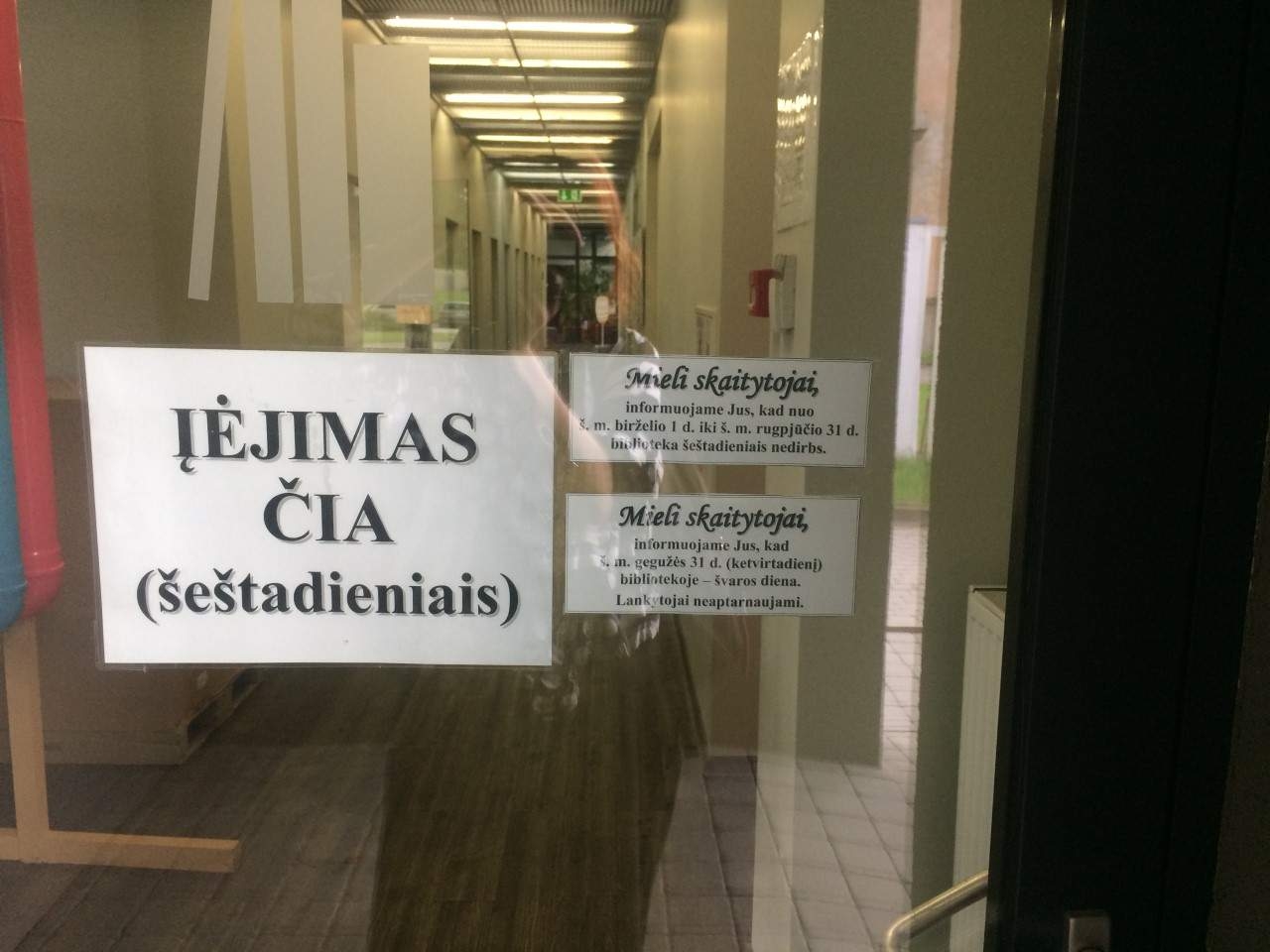
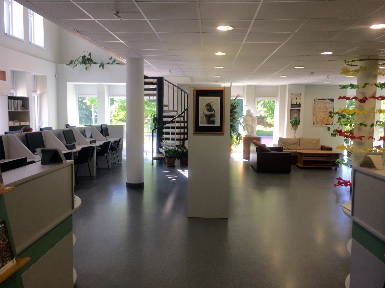
The library, spanning two floors in one of the wings, is accessible through a large lobby, which you can enter either through the main entrance on the Culture Centre side or from the courtyard on the Civil Registry Office side. The library can also be directly accessed through a spare entrance, which is the only way in on Saturdays. From the way the library is localised in the building, we can see that it was not intended to be the main goal of your visit. The library seems to have been pushed aside. In the centre of the building, there is a large lobby with a tall bar counter. The large homogeneous space remains empty, because none of the three institutions can fill all of it and take over.
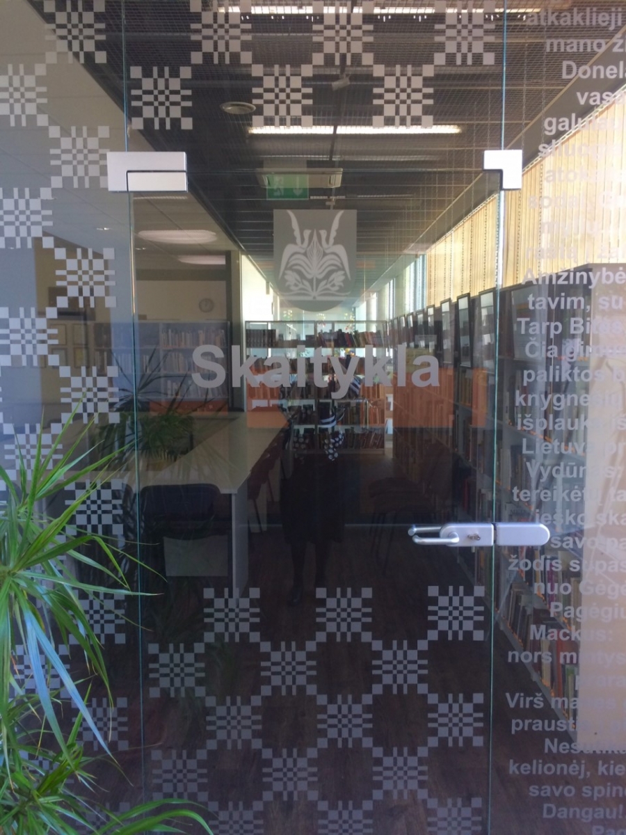
The entrance to the library is not clearly visible. The panoramic glass facade of the Civil Registry Office extends into the inside of the building, creating a boundary between the lobby and the wing that contains the library. This row of panoramic glass windows is where we find the door to our library. Doors and entrances have great symbolic value. Gaston Bachelard, author of the book The Poetics of Space, wrote that a door is the secret of human soul, waiting to be opened. An entrance can be elating, inviting, respectful, open or frightful. Literally and metaphorically, it is a threshold experience. In this case, it is hidden, absorbed into the glass boundary that surrounds the building. Even though its glass, it does not reveal a space behind it, our gaze simply bounces off a wall. We can still get to the library, but the experience is diminished. The library remains hidden. Once you step in, you immediately face an opaque glass door right in your way, with a narrow cloakroom on the left. Nobody welcomes the visitor at the entrance to the library structure. So you have to wander up and down the corridor looking for the library, or step inside the reading room, through which you can go back into the corridor. However, the first reading room we enter is the silent one. Both its purpose and architecturally enclosed nature implies that it should not be a transit area. Usually, library spaces are shaped in a way that guides you from the most popular books and most often-used resources towards the more specific, less visited items, but not here: first we must disturb the silence of the reading room that contains educational literature, and only then can we move to fiction or periodicals. Even though the narrative suggested by the architecture itself is not transparent, the staff of the library weaves it in with their own story on how you should enter the library and what you should experience in it. The symbolic starting point is at the door to the silent reading room, decorated with ethnographic Lithuania Minor ornaments and kind words about Lithuania Minor by the writers of this area. From here we move on into the corridor and the main reading room.
After disturbing the peace of the readers, we turn left and move along another small corridor wondering where it might lead us. A narrow, rather dark passage opens. The architects did not intend it to be that way. The library was supposed to be a permeable space, with the customer service area opening into the corridor through archways. It was supposed to all be a single room. It would have contained the shared reading room for children and adults. The spaces located to the other side of the reading room are separated from the corridor by glass and would have been the silent reading room and a computer classroom for adults. Behind a plain-looking door at the back of the reading room is where the ethnographic reading room would have been, now used as a closet.
Why am I using past conditional?
One important mistake (or a list of smaller ones) caused the whole programme set up by the architects to fall apart. Like a row of falling domino tiles, the library’s functions began to move out of the intended rooms and into different ones. In this chaos, other architectural ideas also inevitably fell apart. However, dominoes never fall randomly, there is always a specific factor that causes this chain reaction.
One of the fateful errors was forcing the child and adult reading areas into one, along with their dedicated book archives. Once the inevitable decision was made to separate them, it acted as an impulse for the organisation to also change the uses of other areas, accordingly transforming their architectural properties. The main space of the library, the customer service area, was supposed to serve all of its visitors. In essence, this is not a bad idea, and a shared reading room for all the visitors could also be functional. Small libraries can have cosy, smart and intriguing spaces. A great example is the 2017–2018 Small Libraries Creating Smart Spaces programme in the USA, reorganising library spaces in a way that makes them suitable for personal development, as well as turning them into meeting places for visitors of all generations, accommodating their various activities. However, when creating a shared reading room for both children and adults, it is not enough to just pick a room; you have to also consider its design, which should aid the visitors in reconciling their often clashing needs, behaviours and activities. The original plan for the ground floor, available on the archmap.lt website, reveals the preliminary arrangement of the reading room. As far as visitors are concerned, it only proposes spaces for individual work. Desks are arranged one after another along the windows. The whole floor area of the reading room is taken up by book cases. Desks by the archways probably indicate staff positions. Based on this plan, they would sit with their backs to the arriving visitors. Or maybe the librarians have no dedicated places at all? No spaces are apparently reserved for interactions, meetings, group work, or simply relaxing with a book or a newspaper. Looking at the plan, it would be hard to find a place for children. Perhaps this is where children’s books are only kept? Although, according the library staff, the children’s archive should not be mixed in with adult archives, as it uses a different arrangement logic. And where will children play, read, have fairy tales read to them or attend various classes? The plan offers no place to settle in comfortably, to chat, learn, work or share an interest in something.
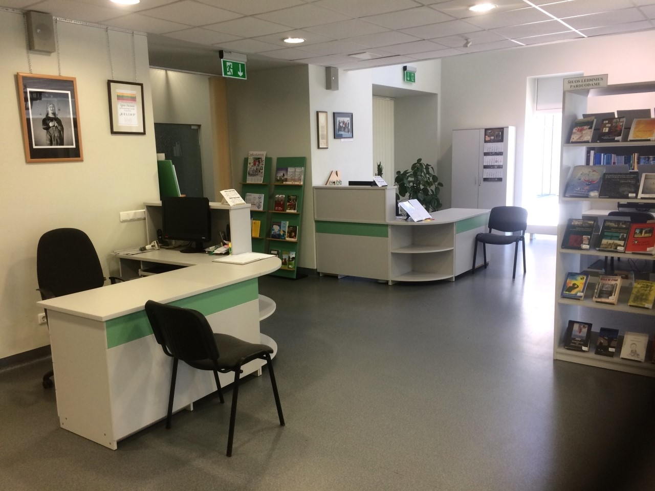
Therefore, once the library moved in, the staff changed the way its spaces are used. They moved the children from the common reading room (customer service area), to the intended adult computer classroom, leaving the customer service area and digital work places in the common room. This also affected the permeability of the space intended by the architects. The reading room, connected through its wide archways to the corridor, featured only a symbolic boundary between the main moving and resting areas. The design similarly ties together the silent area (indicated by individual tables) and noisy areas. Spaces that the users move through are always the noisiest. Mixing movement and rest in such a way requires the visitors to either put up with constant noise or to strictly control their behaviour – their steps, their voices, perhaps avoiding to talk altogether, even in the corridor. Reacting to these problems, the staff created a more enclosed space, separating the reading room from the corridor with vertical blinds. This is how a rather large isolated space appeared, where the staff continued their work on zoning. A reading room, a customer service point, fiction and periodicals were all stuffed in here. A tall book case with the latest books and periodicals separates the computer area on one side and creates a more intimate space to have a seat on the other. In this small space, the staff put a sofa, some armchairs and a coffee table with newspapers, also serving those who want to sit down for a comfy chat. The middle of the room contains open archives, desks for the visitors moved away from the glass partition and towards the archways, now covered up due to temperature issues: it is either too hot or too cold by the windows. Arriving at the reading room, you will be met by two staff members sat opposite each other on both sides of the entrance like Scylla and Charybdis. Positioning them in such a way clearly lacks efficiency and suggests that this was not considered during the design stage.
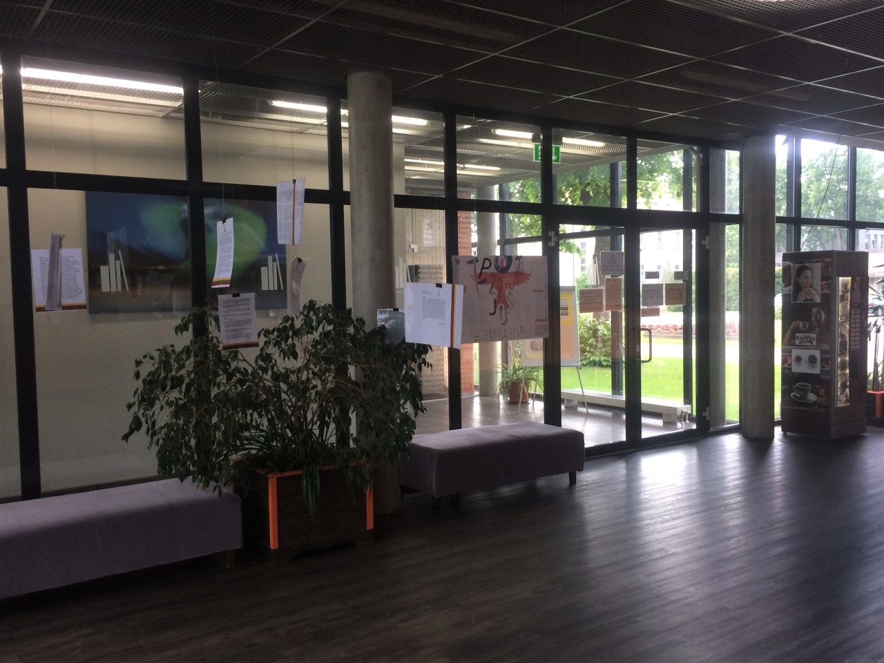
By reshaping the room, the librarians also gained a space for events, which can be held here after moving the chairs and tables aside. The space is also used for exhibitions. Even though there are no specific spaces for display purposes, i.e. the library does not have a gallery or a special wall, the staff manage to get around that in a creative way: after hanging vertical blinds between the reading room and the corridor, both spaces can now be used as an improvised gallery.
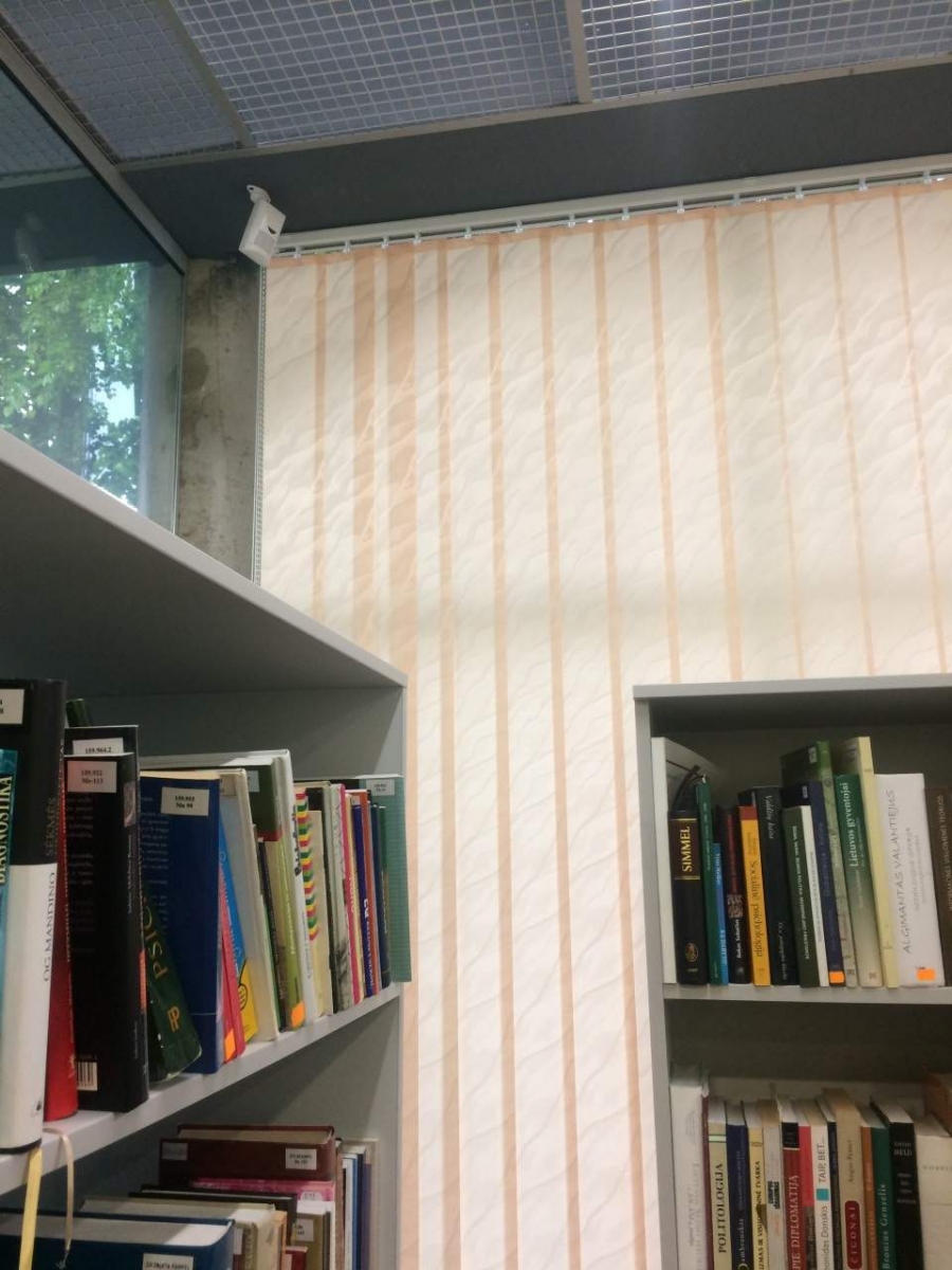
Let’s follow the dominoes further. The silent reading room. Once you step inside, the mismatch between the architectural idea and the way the room is used is surprising. The panoramic glass that replaced a regular wall is now covered with blinds and lined with book cases. Such a radical opposition between form and its contents, where they are not only not helping each other, but are directly interfering, raises a question: how was such a decision made? The idea to surround the library with panoramic glass partially contributed to the failure of intended uses in Pagėgiai Library. The choice is rather popular in the architecture of new libraries, but its rate of success highly varies. In this library, it was not particularly successful, and the way the organisation has dealt with it has significantly eroded the architects’ initial idea. According to the librarians, placing the round table with chairs in the middle of the reading room with not enough space for books was where the conflict between form and contents began. During the design process, the librarians requested a meeting space. This was exactly how they imagined it – a round table for the participants of the meeting (they had also collected and presented examples to the architects). However, as evident from the initial plan, the area was intended as a reading room with a classroom-like arrangement of desks and chairs. No room for books was planned either (because a lot of the ‘walls’ here are glass). Books were supposed to be stored separately, in the area behind the archways. Only a couple of narrow spaces against the wall were meant for bookcases. Therefore, the librarians reshaped the space according to their initial preferences, making it suitable for meetings: a round table for discussions in the middle and bookcases against the panoramic windows. This created a wall that isolates the space from its surroundings. The windows had to be covered with vertical blinds to protect the books from fading. The staff were regretful about the limited, narrow wall space left for bookcases. Actually, the whole principle of storing books in one area and having a reading room in another, was typical in public libraries of the 19th century but eventually evolved into a model where the visitors, the books, the staff and various library services are all in one shared space. Also, as noted by the author of this article during observations in other libraries, the visitors tend to use the library resources (other than the Wi-Fi) right where they are stored. If the books they need are in a room with at least a couple of desks, most visitors will try to find a seat right there rather than walking to a different room dedicated to desks only (with some exceptions, of course).
The silent reading room is used for lectures, smaller events and meetings. However, moving children from the shared reading room to a different one behind a glass partition (the intended computer room for adults), posed issues with co-location and sound suppression: noise seeps through the glass between the reading room and children’s area. Even though the partition goes all the way to the ceiling, the mesh covering it transmits sound, turning it into a merely symbolic boundary. On the other hand, the children’s reading room was placed in a modest but well-lit area with panoramic windows facing the courtyard. Unfortunately, with no direct access to it. The children lack space, while youths are practically left with none at all. Even though the librarians adapted these spaces to be as cosy as possible for the children.
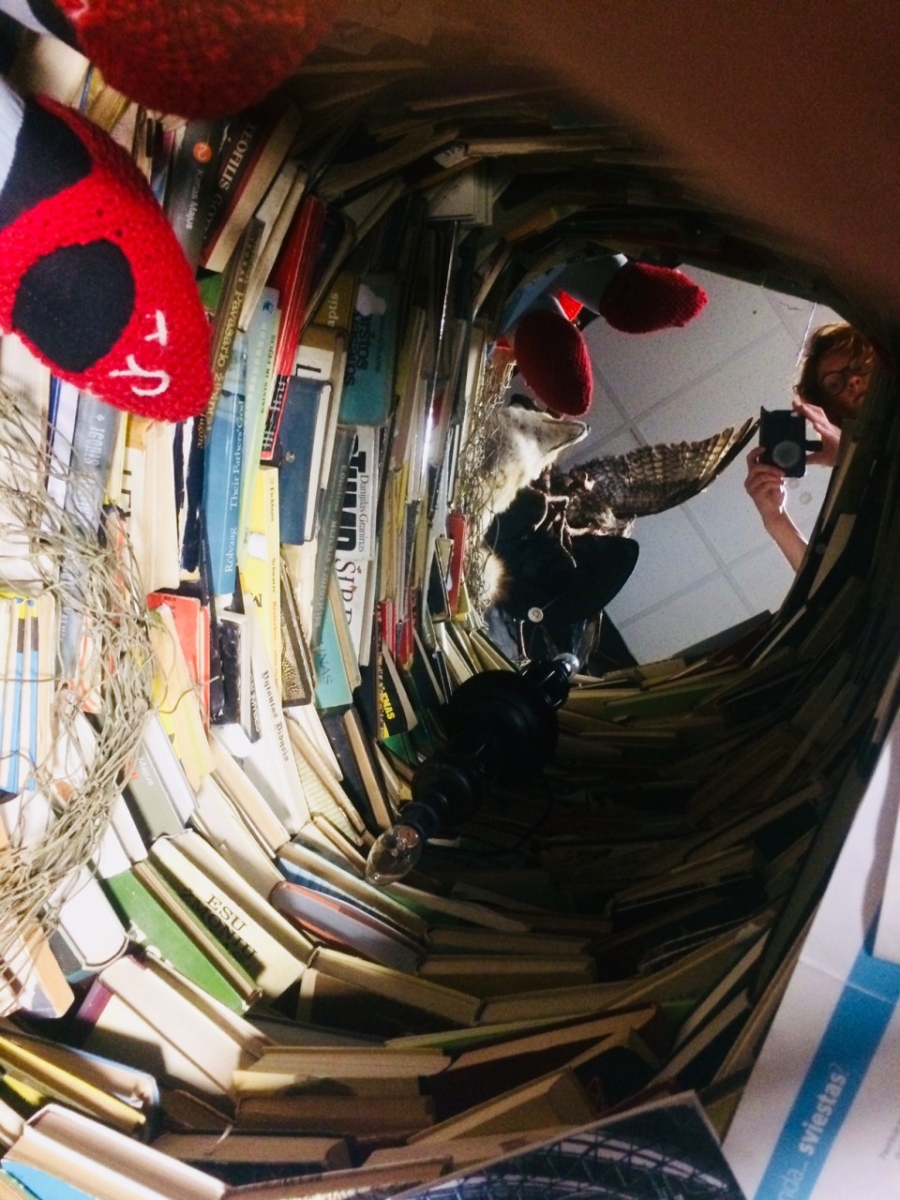
The bus is now half-way there, so let’s try to get more comfortable (are you considering hanging your jacket somewhere so that it doesn’t wrinkle?). A building, especially a public one, can be thought of as a theatre: there is a stage where the visitors perform, and there is a backstage area, invisible to the visitors, but very important for a good performance. In a library, this includes all manner of spaces: closets and rooms for staff items, a small kitchen and a space for spare books. The lack of such spaces also leads to changing the use of available areas. Since no closet was designed, the planned ethnographic reading room was turned into one. The reading room itself was moved to the top floor. This, more of an archive than a reading room, is where people looking for solitude can find a desk with a computer, which, by the way, has its own legendary story: a local writer wrote her books on it, after learning to use a computer at the library.
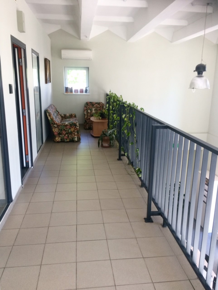
The top floor also contains the administration offices, as well as an improvised exhibition space replacing what was intended to be the director’s office. In the ethnographic reading room and the exhibition space, the huge windows are covered with blinds, because the areas tended to overheat and the books were fading. Of course, these spaces were not initially meant for books but this is where they had to end up in order to suit the library’s activities. Another change was to move the director’s office from its original location to the staff area. The architects intended it to face the visitor space, divided from/connected to it through a glass partition. The idea may sound democratic – the director being always visible and accessible. However, most of us would probably prefer not to feel like a fish in a bowl. This library is no exception. Not only the wish to have some privacy in everyday work but also the severe overheating issues encouraged moving the director’s office to the assistant director’s office, in turn moving her with another staff member into a smaller space. The top floor is also where the librarians hid the library’s little secret – the magical guest room of Suopis, where fairy tales are read to children. Next to the room originally meant to be the director’s office, there is a rather large balcony accessible from the common reading room. The librarians put a sofa and a few poetry books in it, trying to give the space a purpose and encourage readers to use it. However, the purpose of the balcony remains unclear: older people avoid it because of the tiresome climb up a spiral staircase and because they have little reason to go there in the first place, while children are not allowed there for fear they may fall out of the balcony. The potential of the space remains untapped.
All these relocations are related to a number of factors. The librarians have run into various challenges. One of the main ones was the incongruity between the spatial structure and the library’s activities, both because of the spatial configuration (relationships between spaces) and the materials used in the building. As a physical structure, a building is made up of construction materials, i.e. brick, glass concrete or plastic, and utilities systems, and acts through its materiality itself; because of such features as the glass partitions that transmit noise, it is difficult to change the use of the rooms, one must first consider how to reconcile the different functions that will populate the space side-by-side. The spatial configuration and choice of materials creates certain prerequisites that dictate how you should settle in and act within the building. At the same time, the design seems to lack completeness, offering no interior solutions that would adapt these spaces for the activities of the library and the various elements they are supposed to contain. Elements that take up a lot of room and require special conditions, from bookcases and the books in them, all the way to people who require specific conditions for their work and who affect others through their activities. There has to be enough space for children, so that they can interact and play, which in turn creates noise. Also, there have to be quiet spaces for those who need to focus. Everyone should be able to interact: children, youths and adults.
Another challenge the library faced were fluctuations in financing for the building and the operation of the organisation. the library had to move into unfinished premises with no furniture or even so much as an interior design project. The architects supplied preliminary plans for fitting out the spaces (discussed above), but the library area was handed over unfurnished and the plans did not match the vision of the librarians or even the concept of a modern library in general. The same has happened in numerous renovated libraries (in some projects. architects were not involved with fitting out the library itself, in other cases conversations ran into a dead-end because of unresolved conflicts between the architects and the librarians) but depending on the financial and human resources available, the libraries went on to finish their buildings themselves. Great examples include Zarasai, Druskininkai and Birštonas libraries. However, in Pagėgiai, it was more difficult. The library was small, with only 6 members of staff, and no funds for the interior. It was built slowly, fitting out the building step by step, accepting gifts from its users. There is a sense of dissonance between the architects’ aesthetic choices and the library managers’ efforts to settle in. The interior of the library is dominated by sharp corners and the colour white. White is a popular choice for public buildings. The colour goes well with the modernist language of the building, too. But the low-hanging ceiling, sharp archway cut-outs and the whiteness of the walls form a stark environment and the librarians struggle to make it warmer and more lively, bringing in colourful sofas, an ‘antique corner’ and plenty of plants and paintings donated by the readers. However, these efforts visually/aesthetically clash with those of the architects. The librarians’ efforts to settle in cosily and give the building at least some semblance of an identity are in dissonance with the prerequisites posed by the architecture. This raises significant questions in terms of design practice: whether or not and to what extent you should take into account who and how will use the spaces you are creating. Without doing so, the form and its contents will become separate and start working against each other.
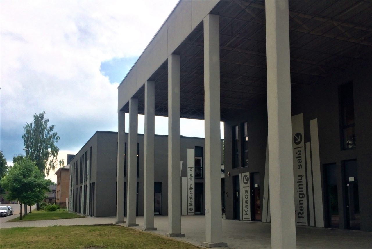
Now, let’s go have a look outside. The building is surrounded by three public spaces, all unique in character. On the Civil Registry side, a small triangular courtyard was created with benches and flowers, sheltered at an angle by the triple-institution-fitting building on one side, and a fence (of dubious purpose) that matches the building on the other, as well as a few apartment blocks. The children’s reading room windows also face the courtyard. Its intimate scale could be useful for the library, serving as an outdoor reading area. Perhaps the courtyard comes to life during weddings, because it has a close connection to the Civil Registry Office as opposed to the mere visual link with the children’s reading room. To access the yard from there, the children would have to go through the whole library and the long lobby, or around the building after leaving through the spare door. Therefore, the link with the library is hypothetical at best. Within the fabric of the city, the courtyard is like a small, drying pond, disconnected from any streams or other sources of water. No paths cross it that lead anywhere. You would have to come in with the specific goal to sit here, which is unlikely as there is not a lot to see or do. If it were directly connected to the library, a summer reading area and event venue functionality would be possible. Another public space is offered by the columns that hold up the roof near the main entrance, creating a rain-free area suitable for events, same as the third one, located behind the building and facing the fields, where the town ends.
So, what kind of a library model do these spaces offer? One that is rather labyrinthine. It is not particularly open or flexible, the spaces are not shaped or arranged in a way that makes them open up to the visitor, guide them through and act as a place for both interaction and quiet work. The librarians are struggling to turn the library into a place of connection rather than collection, a ‘community living room’, a warm, inviting space. But the place remains cold, rigid and sharp-edged. How did this happen? When designing the library, the architects had creative workshops with the librarians, who collected material and presented it to the architects as examples. Why did the library not fulfil their expectations? I believe such incongruities stemmed from the fact that an institution was being designed a mere building. A building operates in relation with the type of business people use it for, the activities and culture related to that type of business. The building also works as a system of relationships between spaces, a material structure that provides the conditions for life inside it, through the experience of light, warmth and cold, its acoustic characteristics, visibility, transparency. When the users and the way their activities and interactions with each other and with the library archives are organised are only signified in an abstract manner – by arranging desk pictures into something resembling a classroom, suggesting that somewhere around here is where the visitors shall settle down, instead of starting the design process itself precisely with the visitors, the way they move and rest, and their interaction experiences – when the architects claim that such issues are ‘of a different scale’ (i.e. too small a scale for them) – that is when problems arise. Then you have to look for your own ways to settle in. Not all spaces are easy to inhabit. When the building is rather large and has well-isolated rooms or, on the contrary, a rather open plan, it can be sorted out through furniture, by adding partitions or distributing functions, visitors and resources into different rooms or different floors. When the spaces are small and the solutions complicated, implying a specific use scenario: reading room space connected through archways with the corridor, other areas separated with partitions that fail to insulate noise, a large number of walls substituted for panoramic glass – operating the building becomes truly puzzling: where do you fit the archives, various users and their different activities, all the services and the staff? Remember the 15 puzzle, where you have to arrange numbered blocks in a box in an ascending order? This is that.
If you are designing a new library, you should do so in an integrated manner rather than just assigning an area. To avoid such mistakes, one has to learn about the acting principles behind the organisation, the institution and the area of social life for which the building is intended. Architects are not, and never could be, experts of all things, but there is a way to design a building that is well suited for its use and to understand the principles behind how a certain institution operates – just listen to the future owners of the building and collaborate closely. In the words of Giancarlo de Carlo, “architecture is too important to leave to architects”.
- s. on photographs: architecture photographs in journals and online portals are often such, that once you see the building in person, it is hard to believe it is the same one. That is why for this article, the library was photographed the way its users see it when they approach and use it. Nothing in the building was removed and we did not try to hide its environment.
- p. s. “Give me a gun and I will make the building move,” once wrote Buno Latour and Albina Yaneva. The building is not a stable, cohesive, finished object, but rather a never-ending complex project, an integrated whole that includes materiality, visions, experiences and narratives, is changing over time and perpetually becoming. Therefore, various different stories can be told about it. And there may be alternative narratives to the one I have just told. These narratives never end.
[1] Pagėgiai Vydūnas Municipal Public Library